Kintsu
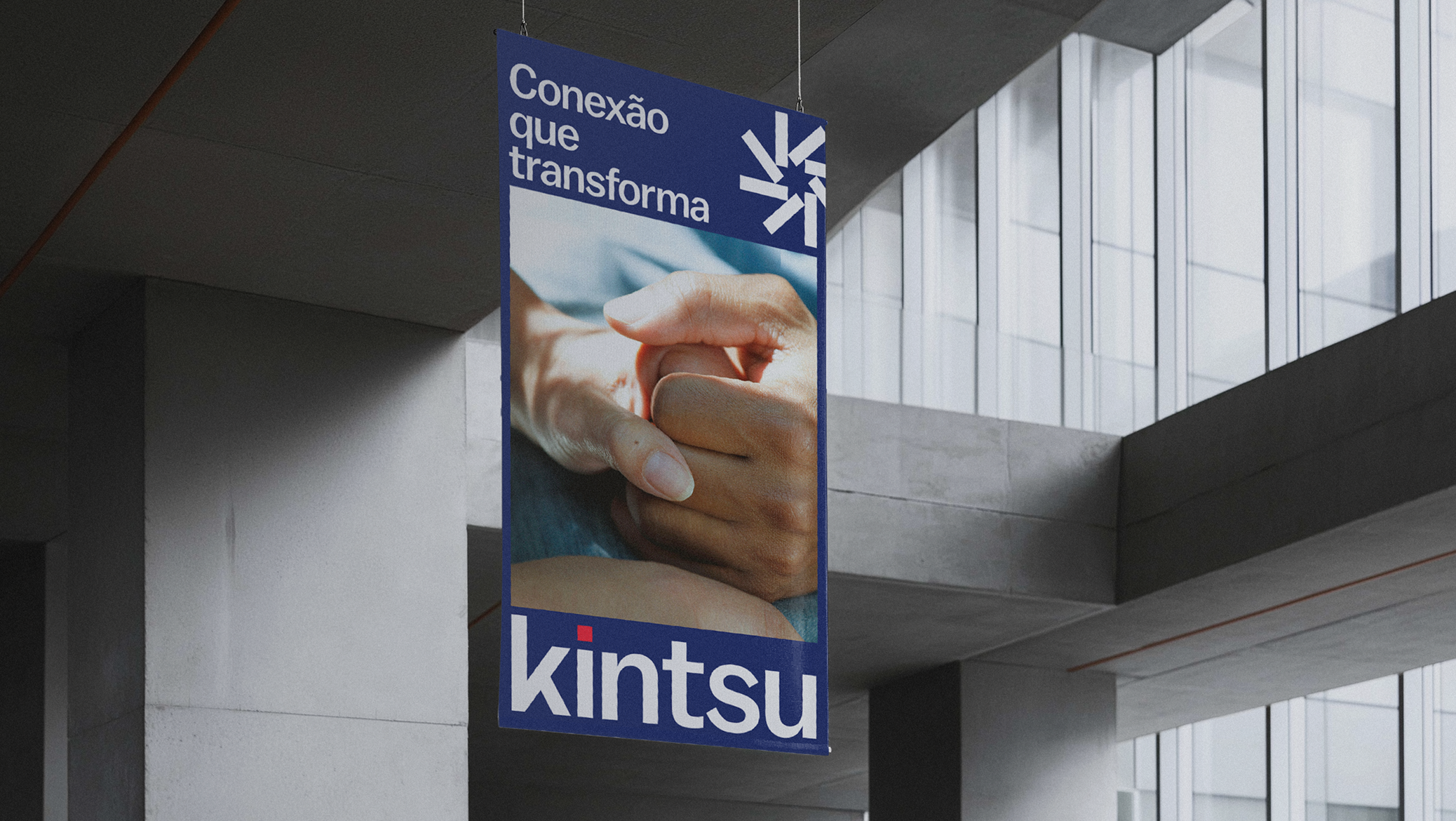
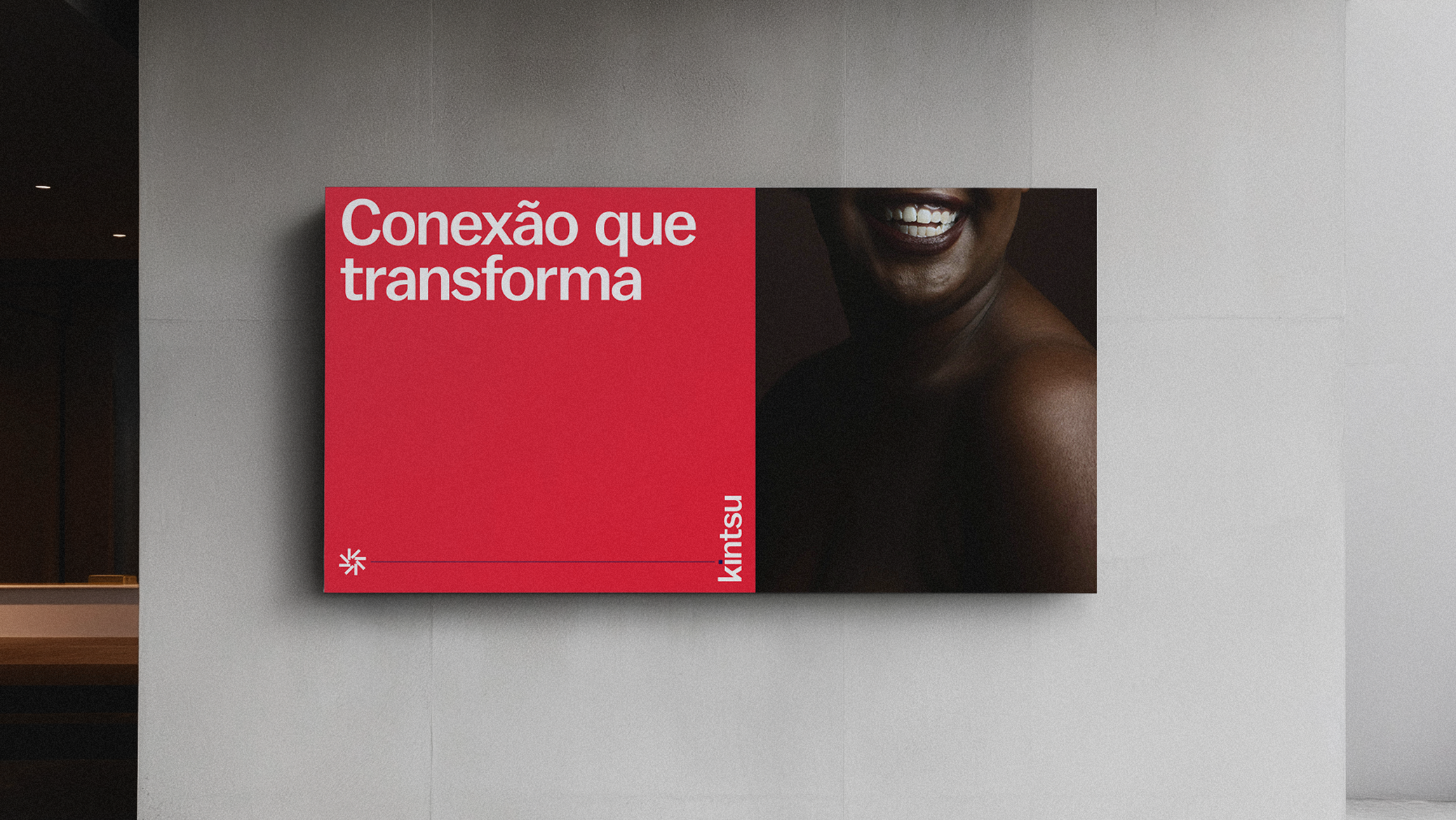
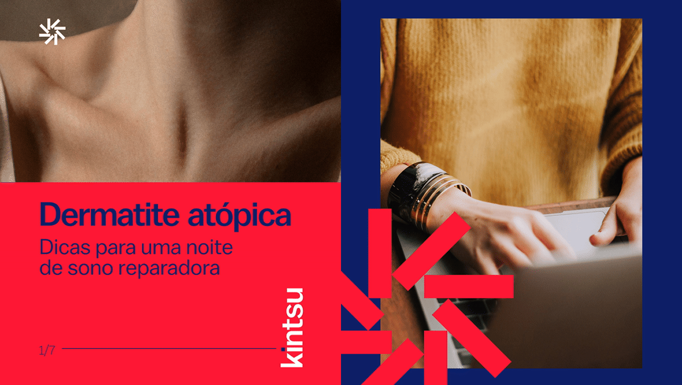
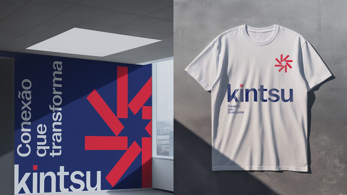
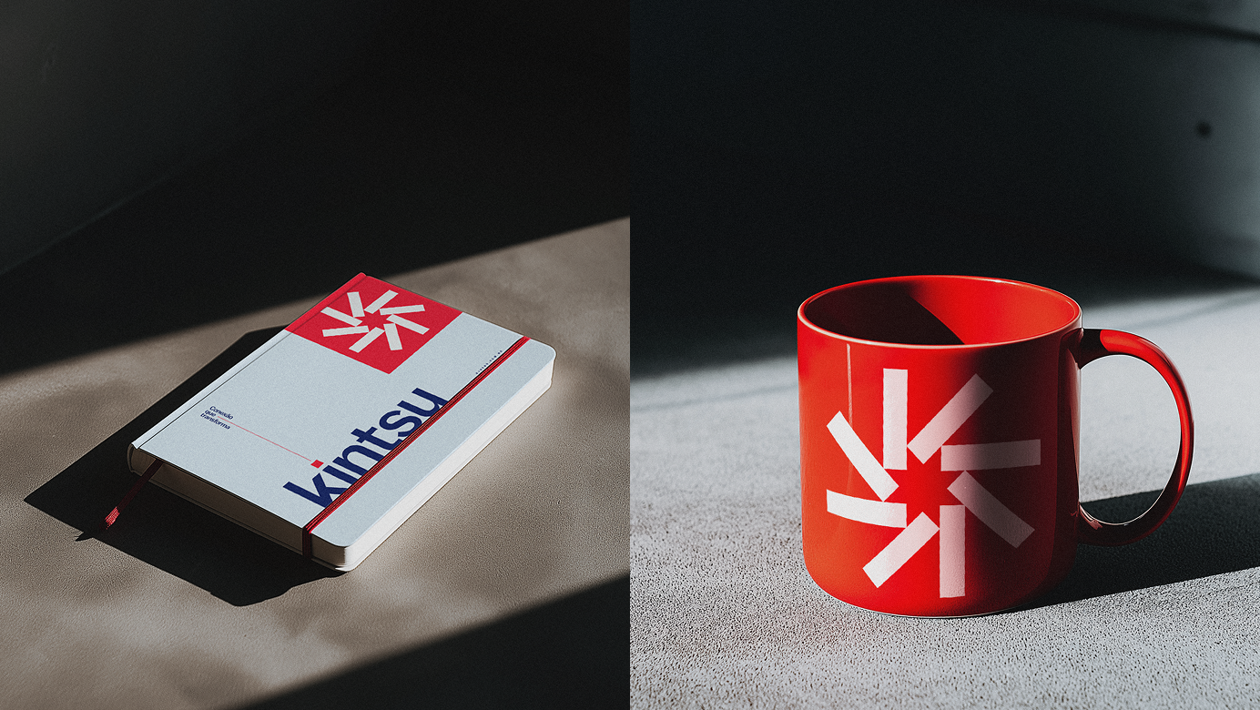
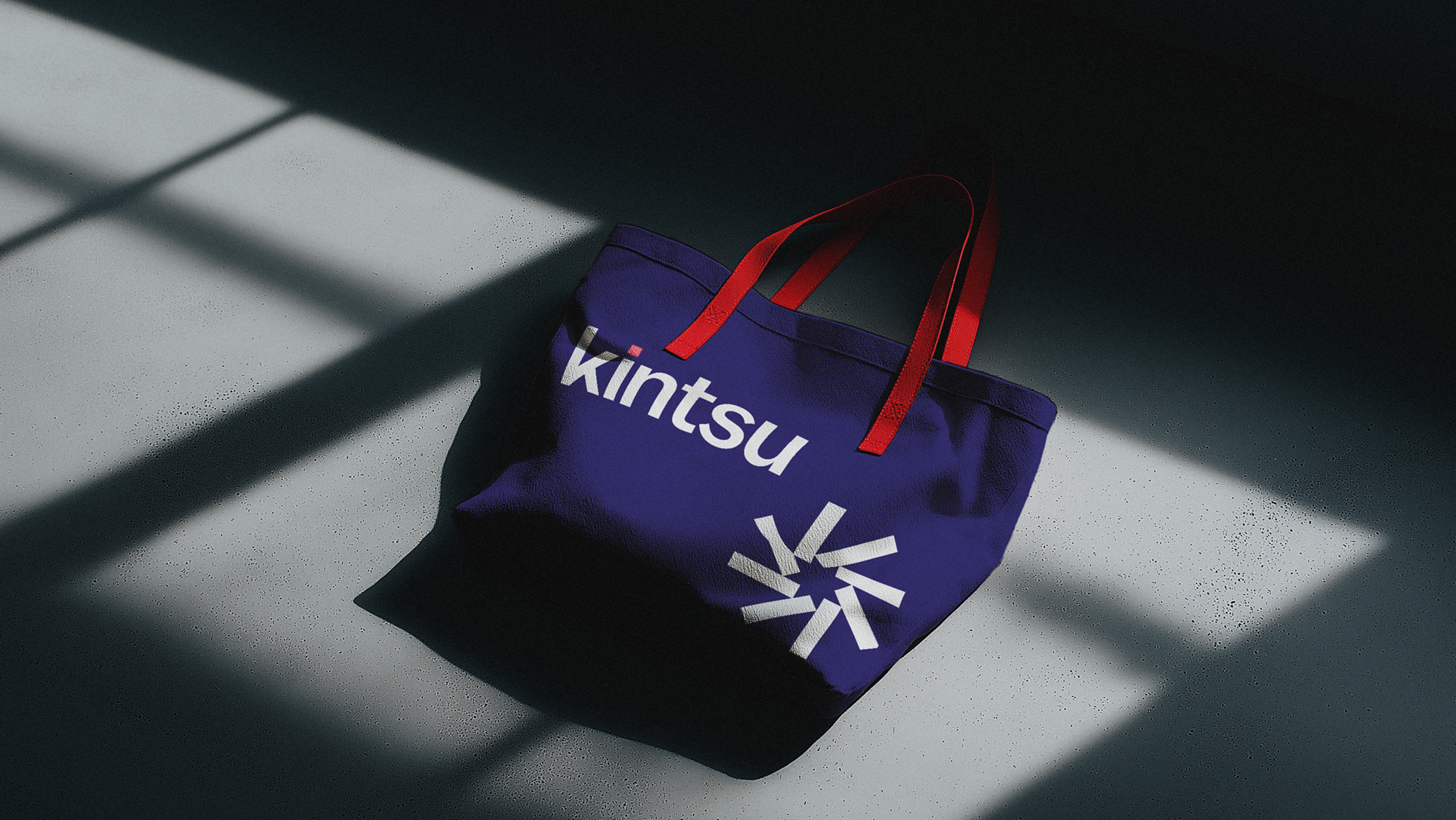
Kintsu operates between health and technology, and the studio took on the redesign to strategically reintroduce the brand to the market, aligning the new identity with the company's goals. Typography was one of the central points: balanced fonts, with less variation in stroke weight, simpler and more uniform.
The name comes from Kintsugi, the Japanese art of mending broken ceramics with gold, and it was this that guided the palette. We found in Aizome, the traditional technique of dyeing fabrics with natural indigo, the reference for the blue tones that went into the brand.