Paytrack
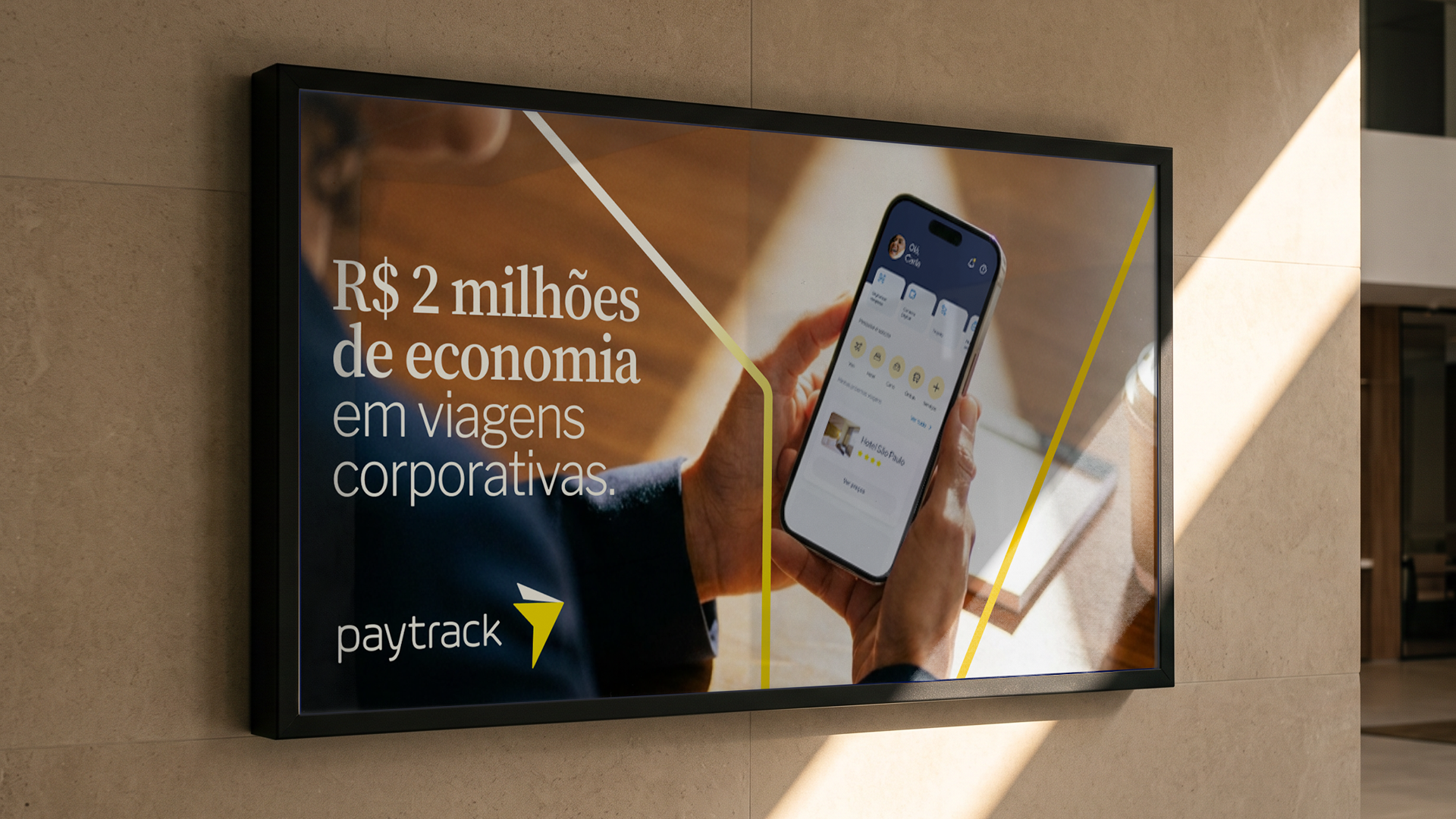
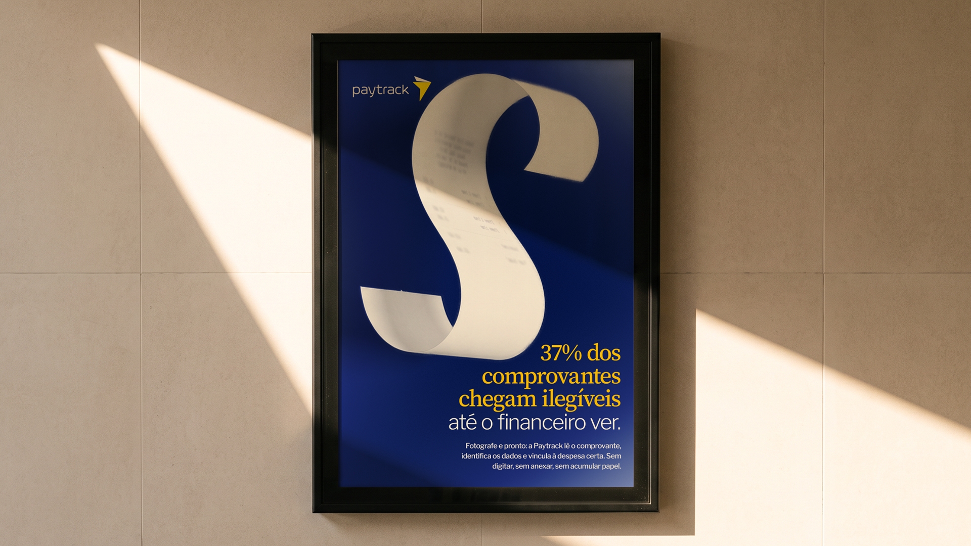
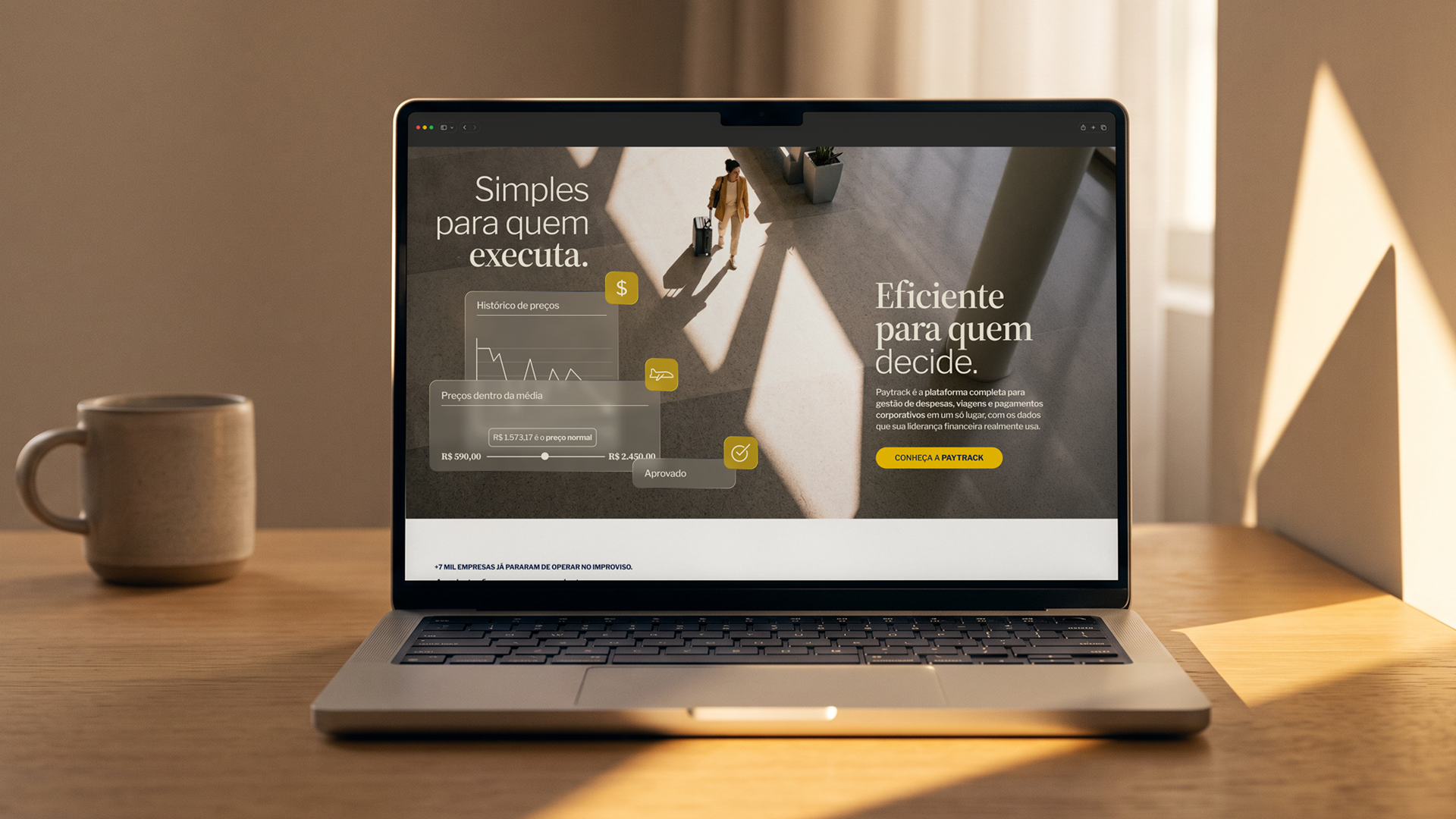
A company that manages R$ 5 billion in corporate expenses doesn't need to follow other companies to be taken seriously. That thinking guided the evolution of the Paytrack brand, a corporate expense and travel management platform. The project wasn't about recreating the brand: it was about expanding its vocabulary, working on typography, color, composition, photography, motion and graphic assets as parts of a single communication. Paytrack speaks to everyone from CFOs and finance managers to corporate travelers, so the visual language had to carry authority and remain approachable.
The system's graphic motif isn't arbitrary: it derives from the geometry of Paytrack's own symbol. In photography, it shows up as the direction of light and shadow; in abstract backgrounds, as gradients. The typography pairs an editorial serif with a second, cleaner and more functional typeface, delivering sophistication without giving up lightness. Color is no longer applied by aesthetic preference but responds to context: one tone for authority content, another for product, another for support. Illustrations that reference the platform's own data interface reinforce the core pillar of the positioning: numbers as the argument, not as a detail. Motion follows the same contextual logic applied to movement: more restrained where the brand speaks with authority, more agile where it speaks about product.